Part 2. Unboxing UX – Two Simple Prototyping Tools
Designers and Engineers need to work together seamlessly to build intuitive and beautiful User Experiences. Unfortunately, in real practice, “throwing it over the wall” is still common. Maybe because that’s how it’s been done for some time, maybe because it seems easier, but ultimately we can all benefit from learning to collaborate better.

One way that Designers and Engineers can work together is by building prototypes. When Engineers (and the rest of the team members) are able to use basic prototyping tools, it becomes easier to explore ideas, iterate, and hold collaborative events like Design Sprints. It opens up the discussion about what the product will be and how a user will interact with it.
There are two tools which I think are great for this purpose: Keynotopia and POP App. They’re the most accessible prototyping tools that I’m aware of. Not only can any Engineer pick these up, but they can also be shared with managers and other stakeholders on the project. POP App is free and Keynotopia is very inexpensive, and they work across most operating systems.
POP App
What is it?
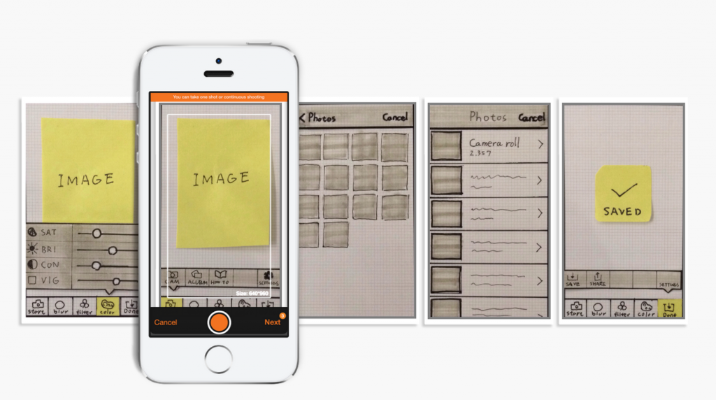
POP App is a mobile app for Paper Prototyping. To use it, you draw wireframes on paper, take photos, and then link the photos together to make a clickable prototype in-app. It runs on iPhone and Android and is completely free.
Here’s what it looks like to use.
When should I use it?
POP App is ideal to use very early in the product development process. You can use it on your own to test ideas, or in very fast team brainstorming and prototyping exercises. The outcome is obviously very low-fidelity, so it should be used to gather early stage feedback and not used for detailed and usability feedback.
Keynotopia
What is it?
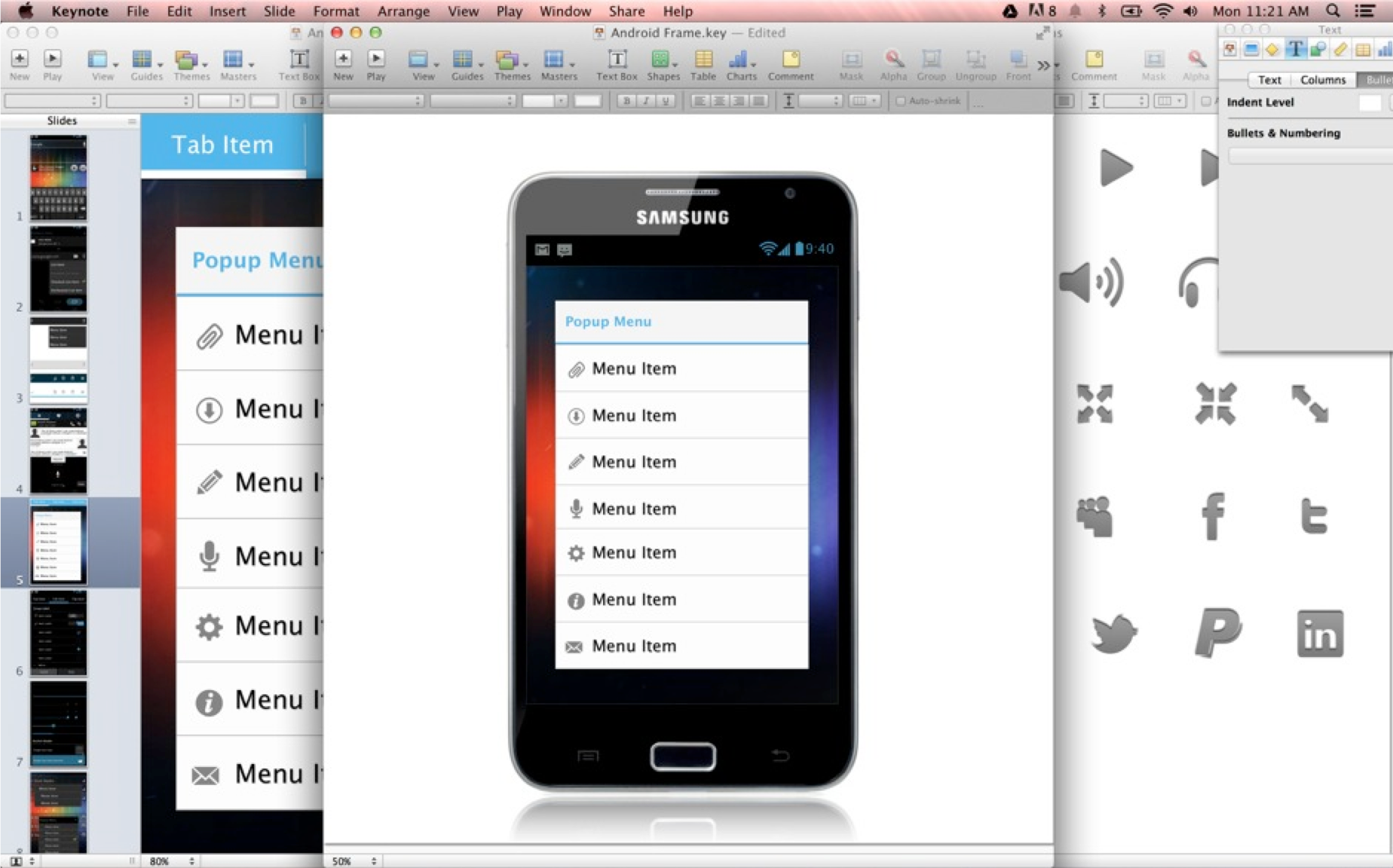
Keynotopia is a set of downloadable templates for Keynote and Powerpoint. There are different packs – for Android, iPhone, tablets etc. All of the elements are drawn in Keynote and Powerpoint, so they’re fully editable and can be animated. There are different packs available for different prices. The outcome is much more high fidelity so it can be used to gather later stage feedback as well as early stage.
A short video on Keynotopia use.
This article is based on a talk that I’ve been sharing at some of the GDG events here in Europe. You can watch that video here.
Part 1. Unboxing UX – Why learn about Design?
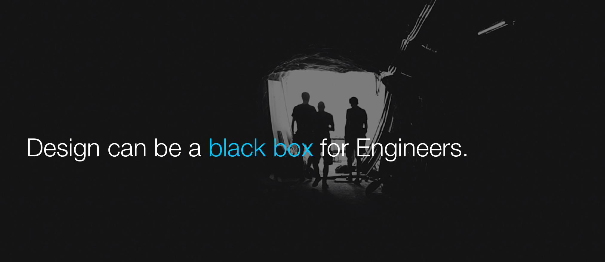
Design can be a black box for Engineers. While Designers are often considered to be the owners of UX, Engineers are responsible for implementation of back end and front. No matter how elegant the design, it’s this implementation where the User Experience ultimately either comes together or falls apart.

When you look at examples of successful UX, they often tend to represent feats of engineering. Google Search is one such example. The speed and simplicity of search goes far beyond the visual and UX design – it’s also about the responsiveness of the technology.
The performance is the UX.
We need designers who are passionate about brilliant technology and engineers who are passionate about immaculate UX. Ultimately, UX and Front end are the same thing. When we learn more about what other roles do, we can have better conversations about the design and technical decisions we make on a day-to-day basis.
UX is a shared responsibility between Design and Engineering.
Part 2 of this post is now available.
Fake it ’till you make it
I was at the push conference today, giving a lightning talk on my process for creating product vision videos. For everyone who attended and wanted to reference the workflows, here they are.


Design events & conferences in Munich
It seems like I meet a new expat here every day, and I hear the same worry over and over.
“Are there even any design events in Munich?!”
Why yes, yes there are. They may be shrouded in the German language or seem less accessible, but there is in fact a flourishing creative community in Munich and they are doing more and more every day. Here are some of my favorite events to go to*:
Refresh Munich
Refresh Munich is a monthly Stammtisch for Designers and Developers. They have a great casual atmosphere, bright, charming attendees and approachable organizers. Definitely worth an evening. They announce the time and place via twitter. More info here
IxDA Munich
The local chapter of the IxDA which has been holding weekly meetings for more than 5 years. We’ve had awesome, very practical talks offered by local designers who are working (in the trenches) and want to help you do your job better. There are a variety of event formats, from the standard talk to the UX Debate (a panel with crowd participation), and a book club. All of the educational components are followed by beer and socializing of course. More here
Creative Mornings Munich
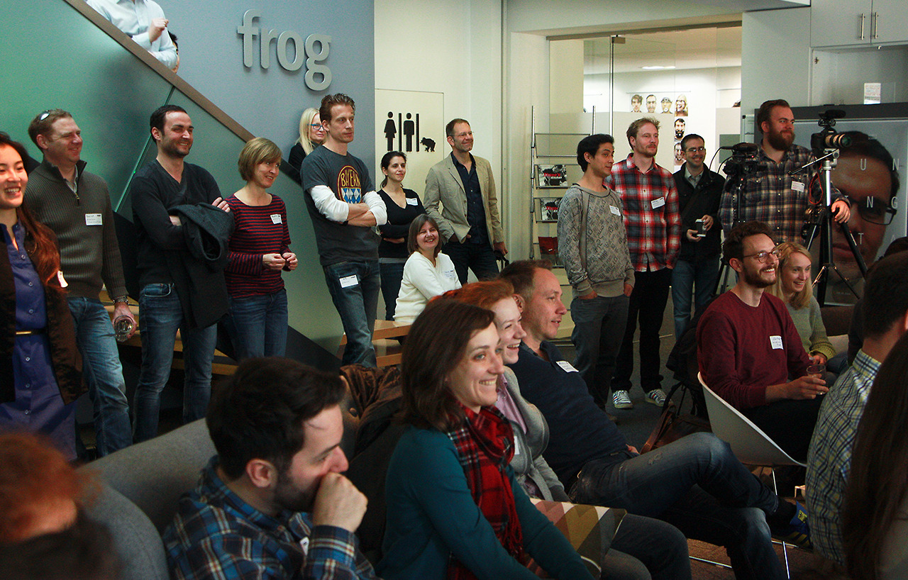
Hosted by frog, these events are short, social and highly inspirational. Breakfast served promptly at 8:30 am, but trickle in until shortly after 9. The crowd at this event is mainly of the Design Professional persuasion and they’re all very approachable, interesting people. Great conversation continues until 10. More here
Munich Design Jam

Munich Design Jam is a day-long hack-a-thon for designers. We’ve been organizing these sessions for the past year (4 quarterly events so far), and attendees are usually a combination of different design and development professions. I couldn’t consider myself more lucky, as we’ve built up an amazing community of brilliant and nerdy folks. Each day is an intensive session of conception and ideation, followed by presentations and of course beers. We’ll be holding the next one within a couple months. More here
Munich Creative Business Week
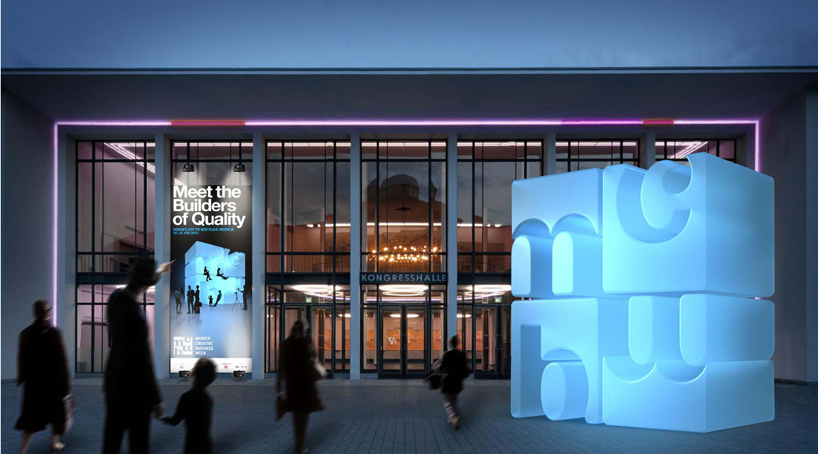
MCBW is a yearly happening, where design studios and industry partners host events, open-houses, workshops, talks and more. Their weakness is their hard-to-navigate website, but there are always so many great events during this time that I’m sad to have to choose. Check it out here
Make Munich
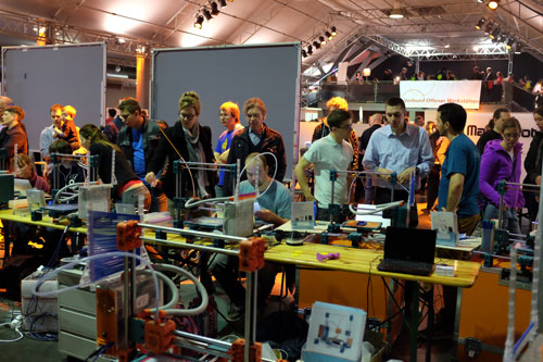
Make Munich is a yearly tech and DIY festival. This was a huge event last year – we had over 2000 attendees over the weekend, with speakers, workshops, demos, and all of the nerdy maker tools you could ever want to get your hands on. This years’ event announcement coming soon. Check it out here
UX Munich
2013 UX Munich Highlights Reel from Refresh Munich on Vimeo.
UX Munich was a totally phenomenal conference held by the Refresh Munich folks in 2013. We’ve heard whispers that it could be a repeat occurrence, so keep an eye out. Check it out here
Push conference

This is a great conference with a focus on digital art and interaction design. Excellent speakers and quality content, with low key interaction. Check it out here
Have I missed any?
*Full disclosure, I’m involved in organizing a few of these.
Illustrator errors from the depths of hell
For those of us who work with Illustraor on a day-to-day basis, we know that there are a few killer errors that can knock what feels like AGES off of your productivity. Here are a few I’ve collected, and how to take care of them.
1. “Can’t move the objects. The requested transformation would make some objects fall completely off the drawing area.”

This error is always especially confusing, and follows you around even when you close the program, open it again, restart your computer and sacrifice a small animal to the tech gods. What’s happened here is that you’ve grouped your artwork with a guide. Go View> Guide> Clear Guides.
Boom, problem solved. (Thanks Chris!)
Solution from chrissagert.com
2. Weird selection artifacts
Sometimes, you’ll be humming along and you’ll suddenly be unable to deselect an object. You can click on and move other things (they become selected as well), but overall it’s just confusing and disorienting. I’m not sure what causes this problem, but if you select the thing which is producing the artifact, then everything returns to normal. Whew!
3. Jumpy mocks
If you make mockups for others on a regular basis, and you have the uncompromising eye of a designer, you’ll often notice that illustrator has difficulty with exporting things in the same place on each artboard. BY ALL REASONABLE ASSUMPTIONS, your mocks should should elegantly move from one screen to the next without any icky “jumping,” but it’s just not so Padawan. The perfect mocks you’ve made look like Mexican jumping beans on export.
The problem? Your artboard is between pixels. Select the jumpy artboard, take a look at the X and Y position. Eliminate any errant digits after the decimal point, and revel in your success.
4. Mavericks hot corners error
This isn’t an illustrator error, but it’s a small one that has a massive impact on my productivity when I’m in it’s vice-like grip. The problem here is that suddenly and without rhyme or reason, your hot-corners just STOP working. I’ve looked around a lot for the cause of this one – it just seems to be a known issue in Mavericks. To fix it, let your screensaver activate (or activate it – that corner seems to keep working). Once you come back, it should be gone.
OK, those are my major pain points at this moment. Let me know if you’ve seen any others that are getting in your way!
8 Red flags for Freelancers
As a student I did freelance work to learn and pay the bills, and before I (recently) joined Google, I spent a wonderful year working as a Freelancer here in Munich. The last year went smoothly and successfully, thanks to a group of amazing clients who always valued my input. Getting great clients isn’t always easy though, and I have my own hard-earned set of spidey-senses to prove it. Lucky for me, I’ve finally learned to always avoid these red-flags:
1. The client doesn’t want to sign a contract.
It’s essential to discuss the project in detail and produce a clear written contract with each client – you’re wasting everyone’s time if you don’t. This contract isn’t just about ensuring payment (though it sure does come in handy for that too). It’s to establish clear communication and ensure that everyone has the same expectations for the project. This can’t be overstated – often when I hear a client-from-hell story, I see an example of mismatched expectations. It’s your responsibility to tease out the requirements at the beginning, before you agree to deliver something you don’t fully understand. A client that doesn’t want to respect that process is going to be very challenging to work with. (This goes doubly for designers, from a client perspective!)

2. The client is not willing to pay up front.
This red flag comes in many guises. Sometimes clients are clear that they’re not willing to make that deposit – but often, they’re not so direct. They might really intend to pay you later, or they may expect you to work without pay (and have plans to let you know this after it’s all done). Either way – “We’ll pay when it’s delivered”, “We’d like to see how we work together before we pay the deposit” and “Just start, we’ll pay you as soon as our funding comes through” are all the same as “The cheque is in the mail.” At the risk of doing unpaid work, your answer should always be “Great! I’ll start the moment that envelope arrives.”

3. The client isn’t willing to pay at all.
Free work is called “Spec work,” and it is the ultimate evil. It’s not just evil being done by the client when you agree to do their work for free – in the case of Spec, you’re being pulled down to their level. When you do Spec work (whether you’re a freelancer or an established agency) you’re devaluing the work of your whole industry. Shame on you. Just to be clear – Spec work also hides out under many names. You can spot it when clients say “We want to get a look at your style before we hire you,” or “This will lead to a ton of paid work!” Design competitions of every colour fall into this category as well. Professional designers care about the state of their industry more than making a quick buck, and they don’t work for free.
4. Rushing to get started & expectations of “cheap work”
These two always seem to go hand-in-hand. A client who pushes you through the early stages of a project isn’t willing to invest in proper planning and error mitigation, and they’re probably not willing to invest in good design either. Clients who claim that they have a very “simple project” which can be done in “almost no time at all!” don’t understand your work, the value you bring, and aren’t going to be satisfied when you (under duress) deliver something half-baked. As an added bonus, they’ll underpay you because what you do can be done in almost no time at all, right? You’re responsible for figuring out if this is the client across the table from you and politely declining their offer.
5. Unclear project requirements
A good client can articulate their needs and the goals for the outcome of the project. If they’re unable to do this – and instead you hear things like “Be creative, think outside the box!” and “We’ll know it when we see it”, then you’re in danger of spending a lot of time flip-flopping between different directions. This rarely has a good outcome for the project, or for the satisfaction of your client. You need to take time to clarify their needs (maybe by putting together an exceptionally clear contract) if you want to take on this project. If what they want still evades definition, politely move on.
6. Your point person isn’t the decision maker
This is more of a yellow flag than a red one. You should know that if your point person isn’t a decision maker, you’re going to need to do more work. You’ll need to answer the questions “Who are the decision makers?” and “What are their perspectives?” at every step in the project. You’ll need to prepare your point person to evangelize the project within their company, including clarifying when they have similar or different goals from the decision makers. If your client is unable or unwilling to do that, the project can’t succeed. You risk working directionlessly or constantly changing direction based on the whims of your clients’ superiors.

7. Lateness, distraction, and other signs that they don’t value your time
Past clients who started off the business relationship by consistently showing up late for appointments or failing to promptly respond to communication were always the clients who committed bigger offenses later on. (These were problems like failing to pay their bills on time or having significant breakdowns in communication within their orgs.) A few little slip-ups are of course excusable, but if you see a pattern, consider it a sign that bigger things are to come.
8. Asking you to pick up after a “terrible designer”
While there is the chance that a company had a bad experience with an inexperienced designer, there’s also a good chance that they don’t have a process for working with designers themselves. If there’s a trail of “bad designers” then steer clear. If there’s just one, then take your time to fully understand the background of the project and learn what went wrong. Proceed with caution, and be aware that this red flag often comes with a “we already spent half the budget” side-note.
To sum up:
In the past when I did do projects for red-flag clients, I was underpaid, my time was wasted, and high caliber work was not produced. There are so many great clients out there at the moment, who absolutely see the value design provides for their business and will respect your contributions to their company. Finding a way to spend the bulk of your time working with them will make you a better designer, fill your portfolio with the kind of work you want to do, and give you the energy and inspiration to pursue a long-term design career. Do that instead.
You do the kind of work that you do
Just after I graduated from University, I was lucky enough to attend a workshop being run by David Sherwin of frog design. He said something that has stuck with me over the last couple of years, and which has strongly informed my practice as both a freelance and employed designer. I’ll paraphrase here, because I don’t remember the exact words, but it was something along the lines of
“You end up doing the kind of work that you do.”
What he meant by this is that when you successfully complete a project, that makes you a kind of “expert” on that type of work- after all, you’ve done it before. That means that it’s easier to find that kind of work again, whether it’a ecommerce site for a Fortune 500, or a brand for a not-for-profit organization. Every time you accept a project and it ends up in your portfolio, you’re not just paying the bills, you’re building a career direction. After a while it becomes harder and harder not to keep picking up the same type of projects (whether you’re a freelancer, part of a small startup, or even working within a large organization.)
The conclusion is that when you choose what kind of work to do, you’re deciding not just whether you’ll do this project but whether you’d like to do a hundred more like it over the course of your working years.
Choose carefully.
What is it that you do, exactly?
As User Experience Designers, we have to answer the dreaded question time and time again. “What is it exactly that you do?” Do you design what’s on the screen? Well – sort of. Do you make the wireframes? Yes, and then some. Do you work with clients, and their users? Surprising to most – that’s actually the most important part of what we do.
This is all a bit bizarre for those outside the inner circle of the design community, since the idea of User Experience is a relatively new concept. The rise of User Experience Designer as career path has been unprecedented, especially considering that it was just coming into existence as I was studying to work in the field. The tools which we use daily are drawn largely from Industrial Design, Ergonomics and the Cognitive and Behavioural Sciences, but also from a lifetime of paying attention to patterns in User Interface. (User Interface: any thing, physical or digital, that I have to work with in order to get something I want.)
As UX Designers, we build tools to test theories, refine user touch points (physical, human, or digital), and encourage user-driven engineering in organizations that typically see the world through code-colored glasses. We’re involved in the high-level conception of products, working directly with Product management and closely with User Experience Researchers. Research is what gives us the kernel of insight that sparks the idea for a new solution. We work to develop the “flow,” which is the series of touch-points making up a product experience. We’re also often involved in product development at the detail level, refining elements of the visual design for clarity, consistency and appeal. UX Designers are always looking to make an imperfect experience simpler, smoother, and more delightful.
In the name of getting a deeper understanding – here are the things we do & the tools we use from the conception of a product to the beta launch:

From ChaiOne Mobile Solutions Blog – I love this image
User Research
Ideally, we would have the luxury of working directly with a Researcher, but in many companies that’s not the reality. There isn’t always an understanding of the value of this role, or there simply aren’t enough researchers to go around. We often have to advocate for research and conduct scrappy studies ourselves.
The two main kinds of research we use are quantitative and qualitative. Quantitative research yields numbers (eg. 35% of our key target group has an understanding of our policies). This research can be quite complex, but a simple approach might be to run an online survey. Qualitative research on the other hand explores how people behave and why they behave that way. This used to mean conducting a focus group- but it’s important to note that there is often a gap in our users’ perception of themselves and their real existence. That’s why it’s important to do and observe, rather than just asking. There are a very wide variety of tools and methods available to Designers for conducting participatory qualitative research. These might include:
-cultural probes
-card sorting
-storyboarding
-acting it out
-participatory design (literally sitting with users as you design a product together)
-paper prototyping for guerrilla user testing
I realize that I’ve just listed titles here – I think that this list necessitates an article in and of itself. In the meantime, an excellent resource is Elizabeth Sanders’ Maketools. There’s also this great explanation from Jacob Gube on Smashing Magazine.

From an article on Customer Journey Mapping. These days we’re wary of anyone who uses the word “customer”, but it’s a nice diagram nonetheless.
Creating a shared vision
Whether working as a freelancer or internally at a company, it is the role of Designer to bring together the team in the name of a shared vision. There are a cavalcade of experts – in management, engineering, and marketing to name a few, with different perspectives on what is most important. Designers use a number of tools to direct the design process amongst these stakeholders and communicate a vision:
-design sprints
-personas
-user journey mapping
-prototyping (paper, powerpoint, high-level adobe software and click dummy builders etc.)
-storyboarding / storytelling (sketches, photos, videos and acting it out)
The goal is to eliminate cloudy goals which lead to wasted time. An expert can collect the knowledge of stakeholders and bring the key insights into the project. It’s only after research and team communication that the actual design can take place.

From Ariel Waldman, on Interaction Design
Low fidelity prototyping
As part of the process of creating a shared vision, and/or after this vision has been created, low fidelity prototyping is often used to flesh out the product. We test the prototypes with users (in casual or lab settings) and iterate on the prototypes based on the outcomes. Here are some of the tools:
-flows
-whiteboard diagrams
-wireframes
-paper prototypes
-click dummies
It’s important to increase the fidelity of prototypes as is necessary for communicating with other designers, team members and project stakeholders.
High fidelity prototyping
Once the flow kinks are worked out, moving fast to high fidelity prototypes is a must. I find myself shrinking the gap between steps whenever possible to speed up the process. This is a luxury of working internally, since the stakeholders and team members tend to already have a great understanding of the process. Here’s what I mean by high fidelity prototype:
-visual designs of screens or communication materials
-motion designs (animations)
A process of testing and iteration is generally recommended with the visual design as well. I’m not a visual designer myself, so I can’t speak to this process as much. However, I do my best to include visual design as part of the testing needs and ensure that it is communicating the right message. When the final visual designs are complete, a spec document is often produced. This is a detailed diagram of layout, spacing, colours, typefaces and other details about the design. The goal of the document is to make implementation as easy as possible.

Code. It’s veery mysterious. (From an article called “Should you learn to code?”)
Implementation
In the software and industrial design worlds, designers work with engineers (software, hardware) in order to get things made. I’ve written about these steps as a clear linear process, though it’s anything but. As a designer, it’s important to collaborate with engineers at every stage in the process in order to avoid technical pitfalls later on, and to take advantage of their own interface expertise. Designers in the software/tech fields should also have a basic or intermediate understanding of code (in fact, many have computer science degrees themselves) in order to work well with engineers and find creative solutions when faced with a challenge.
Testing
As a freelancer or working internally at a company, under no circumstances should a designer forget this step. Testing any designed product is essential, since engineers are not trained to see the world as you are. Spacing issues or typography choices that look like glaring, unmistakable errors to you are functional code to someone else, and it’s your job, not theirs, to catch it. (Though any engineer worth his salt will be professional enough to fix it.) Thoroughly test every website in all the browsers you care about, on all the platforms that matter to your users, or expect that there will be mistakes. That’s the professional standard.
You should:
-ensure compatibility across devices, mobile and desktop
-ensure that internationalization and localization are correctly implemented
-address edge cases and bugs, and
-learn from feedback in order to refine
At this point, you’ve found the errors in implementation, and discovered some of the weirdness that should be ironed out of your product. Hooray! You’re ready for Beta.
The most interesting part of this process is testing with real users when you release your product into the wild. Users always seem to find new ways to use your product that you hadn’t imagined.. and new ways of breaking it, of course. That’s usually when we start again, iterating and iterating.
Key Principles of Scrappyness
9 Things I learned at the Seth Godin Summer Program
A few months back I applied online to be part of a 2 week internship with Seth Godin, and was accepted to become one of 17 interns who would join a radical, diverse team. Over the course of 12 days we built a product which is now in the process of being released. Meanwhile, two months down the road from an intensive and transformative experience working with Seth Godin and a team other of intrepid interns, I’m finally feeling able to distill the brimming 2 weeks into some concrete learnings. Many of the things we learned are hard to articulate; instincts, internalized approaches, habits and techniques. That’s a different blog post. Until then, here are some good principles to go by:
1. Panic early, thrash early
Seth introduced this concept on the very first day, and we lived by it. Thrashing is the discussion, argument, taking-of-stands and thoughtfully carving out a conclusion about what something will be. Usually, thrashing increases exponentially as the project progresses, as details come out that need to be clarified, and as more people must be consulted to allow a decision to be made. The problem with this is that it saps momentum and makes it increasingly difficult to finish a project.
This is why the thrashing must happen at the beginning. At the beginning, everyone is allowed to have an opinion on everything, but as the timeline progresses, fewer and fewer people are allowed to have a say. In order to allow this to work, it’s essential for people to take stands on pieces of the project which are important to them early on. Making a choice about what the project is and what it is not is a very challenging practice. It allows for little compromise and requires a great deal of personal risk-taking, but cuts down dramatically the barriers to completing a project. At the end, people should have clear ownership of small pieces and be allowed to make the final decision on what that one piece will be.
2. Five minutes of planning can save five hours of work
When time is short, being in perfect sync with your team is absolutely essential. Along with thrashing, it’s important to plan the work sprints you’re doing as a team. Having a short standup meeting before each sprint can ensure that everyone is on the same page and that no one is doing overlapping work. Failing to do this can really eat time and create conflict. Definitely avoid.
3. Set scary deadlines, then overshare
This is something Seth pushed us to do every day of the internship. (Think you need an hour? Make it in 45 minutes.) Every time we did, I was surprised completely by what we could achieve. I’m convinced now that the extra time spent (that I always wanted) would have yielded only a fraction of the return. This was where the second part came in – getting feedback on our work BEFORE we felt it was ready meant that mistakes were corrected instantly, blocks were removed and we didn’t end up going down rabbit holes.
4. It’s easier to know what we don’t do
In a room full of clients or collaborators it’s often hard to say “no.” To state that there is a plan to exclude some people rather than make a product that’s for everyone can be a very controversial stand to take. A great way to start the discussion around this question is to ask “Who is this NOT for?” By allowing yourself to be specific and to target a specific audience, you open the door to create something that is an exact fit for some people, rather than a mediocre fit for many.
5. Build a team of shippers
In a startup, your team must be lean. It’s no longer ok to have a person around who is simply a talker or thinker. Every person needs to be able to make something- that might be articulating thoughts into a clear 1 year plan, or it might be coding your first prototype. Whatever that is, everyone on the team needs to be capable of making- if only so that they can understand the importance of making the transition from talk to do.
On a more personal level – I’ve found that the shortest way to my own bliss is to be surrounded by people who can think deeply and quickly, communicate at lightning speed, then be ultimately driven to build something based on a shared kernel of insight. A group entirely composed of shippers is a powerful force.
6. Target users who will get it, want it, & scale it
Building a new product or a startup company, you’re aiming to grow your user base quickly in order to reach a larger audience who will adopt your product early, help you to test and improve it, and then feel enough of a sense of ownership to share that product with their friends. In order to do this, you want to aim at people adopt early, recognize innovation, and who talk about it. At the beginning of a project, think about which is the right group of target users to aim your first launch at (products often have more than one). This first step is about growing and building your user base- not about serving everyone or saving the world. That comes later.
7. Answer: Do I trust you? What do I get? What do you want me to do?
A successful interaction (website, application, advertisement, physical product, sales call…) answers these questions, in this order. Failing to answer any of them at the time that they are being asked means that you lose the attention of your user. How can this be avoided? Let’s break it down: Trust is made up of voice, story telling and associations. The product should remind me, through these modes of communication, of something that I already trust like an existing product, person, or brand. You need to understand the perspective of your target user and know what kind of things they tend to trust.
Next, you need to answer the question of what the user will get from interacting with you. That’s your offering. It should be completely clear via all modes of communication (copy and tone, imagery, the feeling of your brand) not only what they will get, but the essence of how that offering feels. (Is it a luxury product? Is it about authenticity?)
Lastly, if the user trusts you and sees that what they get is something they want, there needs to be a smooth transition to the ask. There should be a BIG BUTTON that just means “give it to me.” All else can follow.
8.Be real
Making something is a tiny way to change the world. Before you begin building, establish for yourself and your team the reason why. This sense of purpose comes through in the product and goes directly to your users, who are smart and can sense a lack of authenticity when it’s present. They’ll stick around and you’ll be better off if you know what it is about the world that you’re trying to change at the get-go.
9.Own it
Doing all of these things is hard. Sometimes you’ll fail and sometimes you’ll succeed. The most important takeaway I found from the Summer Program was this: When you’re flying high, people try to pull you down. It’s easier to criticize than take a stand, so people who don’t ship will make themselves very busy telling you that you can’t or shouldn’t do what you’re doing. Don’t listen. At the Summer Program, I experienced how much easier it is to go far when you surround yourself with other people who are willing to join you in getting out on a limb and trying to deliver the future in a neat and pleasant package. Work with those who don’t feed the trolls and never look up from your vision.
Seth’s video about the project is here.
A number of the other interns have already written inspiring, insightful posts about the internship experience, what it revealed for them and how they grew as people. I would definitely encourage you to go read some of those posts here, here or here.
Make Munich
Make Munich is Germany’s first Maker Faire style event, and will be held at the München Tonhalle on April 20/21. The 2-day event will feature topics like 3d printing, laser cutting, creative electronics, product design, robotics, guerrilla gardening and craft.
We’ve been working hard to organize the event for the past few months, collecting a wide variety of Makers to represent different areas of interest. We’ve focused on hands-on and interactive exhibits, where people can see real projects, ask questions from the Makers, and participate in workshop to learn about Making themselves.
Where: Tonhalle, Grafinger Straße 6 81671 Munich, Germany
When: 20th-21st April